Nothing Is the New Everything: The Quiet Colors Taking Over Your Feed
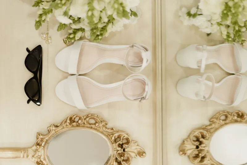
Open almost any high-end fashion account right now and you'll notice something strange. The color is... gone. Not entirely, but mostly. What's left is a particular register of non-color: warm oatmeal, cool dove gray, the kind of sand that looks like it came from a beach that costs a lot to get to. It's the visual equivalent of a room where everything is expensive but nothing is trying.
This is the quiet color moment, and it's not quiet at all — it's making a very loud statement about who you are and what you can afford.
How Boring Became Beautiful
To understand why neutrals feel so loaded right now, you have to understand what they're reacting against. The past few years of social media aesthetics have been aggressively maximalist — dopamine dressing, Barbiecore, the unhinged joy of a neon-pink moment that felt genuinely liberating after two years of pandemic gray. Color was rebellion. Color was proof of life.
But the algorithm-driven color rush had a side effect: everything started to look the same. When every influencer is wearing the same cobalt dress because cobalt performs well in Reels, cobalt stops being a choice and starts being a uniform. And the moment a color becomes a uniform, the people who care most about distinction start looking for the exit.
The exit, as it turns out, is a $400 linen shirt the color of an overcast Tuesday.
The Luxury Industry's Long Game
Here's the thing about neutral palettes and luxury brands: this isn't new territory for them. The Row, Loro Piana, Brunello Cucinelli — these labels have been operating in a palette of warm nothings for years. Their customer was never chasing trends; their customer was paying specifically to not chase trends. What's changed is that this aesthetic has migrated outward from a very small, very wealthy enclave into a much broader cultural conversation.
The mechanism for that migration is partly aspirational and partly reactive. When The Row's minimalist silhouettes started appearing on the moodboards of mid-range brands and fast fashion knockoff accounts simultaneously, the look became democratized in the usual way — and then the people who originated it had to recalibrate. But the palette itself has proven remarkably durable, because it's genuinely hard to replicate cheaply. Neutral colors are unforgiving. A slightly off-white in a synthetic fabric reads completely differently than the same shade in a washed linen or a heavy cotton. The quality of the material is visible in a way that a bold print can mask.
That's not an accident. It's essentially a built-in gatekeeping mechanism.
The Feed Aesthetic Shift
On social media, the shift toward quieter palettes has a slightly different driver. Influencer feeds that used to look like paint store explosions are increasingly being rebuilt around cohesion — a single dominant tone, maybe two, maintained across dozens of posts. The visual effect is almost meditative. Scroll through a well-curated neutral feed and your nervous system genuinely responds differently than it does to the saturated, high-contrast content that dominated even two years ago.
Creators who've made the switch describe it in similar terms: the muted palette feels more like them, less performative, less exhausting to maintain. But there's also a practical dimension. A cohesive, calm aesthetic tends to attract a different kind of follower — one who's there for a particular sensibility rather than a particular trend. That audience is smaller but stickier, and for creators trying to build something sustainable rather than just viral, stickiness matters more.
There's also a growing awareness that high-saturation content is increasingly associated with a certain kind of hustle-culture performativity — the ring light, the fast-cut edit, the urgent call to action. Opting out of that visual language is, for some creators, a genuine ideological statement.
The Psychology of Visual Calm
Designers and color researchers have been pointing out for a while that muted palettes trigger different neurological responses than saturated ones. There's a reason spas are beige and emergency rooms are not. In an environment of near-constant visual stimulation — notifications, headlines, the relentless churn of content — a space or an outfit that asks nothing of your eyes starts to feel like a gift.
This is probably why "quiet luxury" resonated so hard as a concept when it started circulating online. It named something people were already feeling: exhaustion with the effort of being visually spectacular, a desire for aesthetics that communicate without shouting. The irony is that the concept itself went extremely viral — a beige idea that burned bright across every corner of the internet before settling into the culture as something that feels almost obvious now.
The Tension at the Center
For all its appeal, the quiet color moment carries a real tension. Minimalist neutrals as a status signal are inherently exclusionary — they work precisely because they're expensive to execute well and easy to get wrong. The aesthetic communicates wealth partly through its refusal to try, and that refusal is itself a kind of trying that requires resources.
There's also a legitimate critique about whose neutrals get celebrated. The "nude" palette that luxury fashion has historically centered is a very specific set of skin-adjacent tones that have never been neutral for everyone. As the conversation around the quiet color trend has evolved, there's been a growing push to expand what counts as a muted tone — to include the dusty terracottas, the deep warm taupes, the slate blues that read as understated and calm without centering a single narrow idea of what skin looks like.
That's probably where the aesthetic goes next: not louder, but wider. Same energy, more range.
In the meantime, the beige moment is very much still happening. And somewhere, a brand is releasing a $280 t-shirt in a color they're calling "fog" or "parchment" or "morning" — and it's going to sell out.